


If you’re in the world of Direct-to-Film (DTF) printing, you’ve likely encountered this frustrating issue: your DTF print looks different than the design you see on your screen. The reds aren't right, the blacks are too dull, and everything just feels “off.” This phenomenon, known as DTF color mismatch, is more common than you think and it’s fixable.
In this blog, we’ll explore the key reasons DTF colors don’t match your screen, dive into DTF printer color management, and share simple, actionable steps for adjusting colors in DTF designs so your prints finally come out just right.
Understanding the Root Cause: Screen vs Print Color Difference
One of the main reasons behind this issue is the difference between how colors are displayed digitally (RGB) and how they’re printed (CMYK). Screens use light, while printers use ink. Your vibrant digital design might rely on RGB colors that simply don’t translate well into CMYK.
This screen vs print color difference causes certain tones especially neons, bright reds, and blues to look faded or muted once printed. And that’s why DTF colors look dull compared to your original file.
Why DTF Color Mismatch Happens
Here are the most common culprits behind DTF transfer color problems:
1. No Color Calibration
If your monitor and printer aren’t calibrated, you’ll always be chasing the perfect print. Without color calibration for DTF printing, what you see isn’t what you get.
2. Wrong Color Profile
Designing in RGB or the wrong CMYK profile will produce inaccurate results. Use a standard color profile optimized for textile printing.
3. Unmanaged Printer Settings
Many entry-level or mid-range DTF printers don’t come with optimized color management out of the box. This leads to DTF printer color management issues, where the printer doesn’t interpret colors as intended.
4. Outdated RIP Software
Your RIP software converts the digital image into a print-ready format. If it’s misconfigured, it contributes to DTF color mismatch and inaccurate output.
How to Fix DTF Color Issues: Practical Tips
Getting consistent, accurate DTF colors is totally achievable. Here are some practical steps for DTF color correction:
Calibrate Your Monitor
Start with color calibration for DTF printing. Use tools like the Datacolor SpyderX or X-Rite i1Display Pro to ensure your screen shows true colors. This is the foundation for everything else.
Use ICC Profiles
Download or create ICC profiles that match your specific printer, ink, and film combination. These profiles help bridge the gap between screen and print, enhancing DTF color accuracy.
Work in CMYK
Always design in CMYK from the beginning preferably using Adobe Photoshop or Illustrator. This helps minimize surprises related to screen vs print color difference.
Update Your RIP Software
Make sure your RIP software is current and configured correctly for your specific printer. Incorrect RIP settings are often why your DTF print looks different than design.
Test & Adjust
Run regular test prints and make manual adjustments. A print that looks good on one material may not translate the same to another. This is where adjusting colors in DTF designs becomes essential.
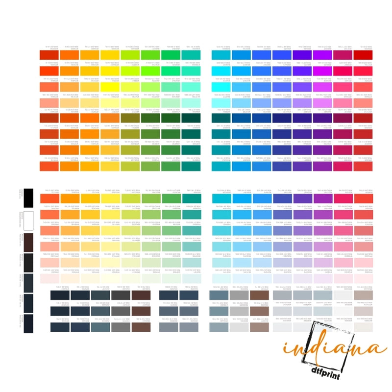
Best Color Settings for DTF Printing
Getting the best color settings for DTF printing involves trial, error, and experience. But here are some tried-and-true guidelines:
- Resolution: 300 DPI or higher
- Color Mode: CMYK
- Black Point Compensation: Enabled
- ICC Profile: Custom profile based on your printer and ink
- Color Space: Adobe RGB (for broader gamut)
By standardizing your design files with these settings, you dramatically reduce DTF transfer color problems.
Common Mistakes to Avoid
Let’s look at what not to do when dealing with DTF color mismatch:
- Designing in RGB and forgetting to convert
- Using generic printer settings for all materials
- Ignoring ICC profiles
- Over-saturating colors to compensate
- Skipping test prints before final production
These mistakes directly lead to DTF print looks different than design and lower customer satisfaction.
Summing it Up
If you’re wondering why DTF colors look dull or your designs never quite match your expectations, know that you're not alone and you're not powerless. The key lies in taking control of DTF printer color management through proper calibration, profiles, and print settings.
It takes time to master the balance between screen design and printed output. But with the right practices in place, you’ll start seeing sharper, more vibrant, and more accurate results in every print.
For more DTF printing guidance and reliable products, visit Indiana DTF Print your go-to source for print quality, technical know-how, and expert support in overcoming DTF color correction challenges.
Frequently Asked Questions
1. Why do my DTF prints look different from my screen?
DTF prints can look different due to color mode mismatches (RGB vs CMYK), poor monitor calibration, or incorrect printer settings. What looks vibrant on screen may print dull without proper DTF printer color management.
2. How can I fix DTF color mismatch problems?
To fix DTF color mismatch, calibrate your monitor, use the right ICC profiles, update your RIP software, & design in CMYK mode. These steps improve DTF color accuracy & help your print match your screen design.
3. Why do DTF colors look dull or faded after printing?
This often happens when using an RGB file for print, or if the ink and film combo isn’t optimized. Poor color profiles and printer settings can also cause DTF colors to look dull.
4. What color settings stand out for DTF printing?
The best color settings for DTF printing are designing in CMYK, 300 DPI resolution, and using correctly applied ICC profiles. These things are key in ensuring bright colors and eliminating any surprises in terms of colors during printing.
5. Can I improve DTF print colors without expensive equipment?
Yes! Start with basic steps like using CMYK color mode, doing test prints, & adjusting settings in your design software. Even without high-end tools, you can reduce DTF transfer color problems through good habits.


