


Key Highlights
- Use high quality inks and films to increase DTF print vibrancy naturally.
- Optimize design files to ensure maximum DTF prints color punch.
- Proper pre press, heat press, and pressure settings enhance brightness.
- Correct post press care maintains color longevity.
- Advanced techniques like double pressing or underbase layers further improve DTF transfer color optimization.
DTF transfers changed the game for making bold, sharp designs on clothes. Yet despite using top grade materials, colors can come out flat now and then. Getting richer tones means understanding what shifts the outcome behind the scenes. If you're just starting or already deep into printing, small tweaks can wake up your colors. Brightness hides in details most overlook, find them, adjust, move forward. Each step shapes how loud or soft a design speaks once it lands on fabric.
Understanding DTF Print Vibrancy
Getting better prints starts with knowing what changes DTF color strength. Ink choice shapes the outcome, so does how you run the printer. Preparing the transfer matters just as much as the heat press numbers. Temperature, pressure, time, each tweak shifts the result. After pressing, handling makes a difference too. Nail every piece and colors turn sharp, clean, strong.
Fabric choices matter less when using DTF printing, since vibrant color reproduction works across materials. Specialized ink sits at the core of this method. A film transfer carries the design directly onto textiles, skipping traditional limits. Full range visuals appear without fading detail. But even the best DTF prints color punch can be compromised if your workflow doesn’t account for these critical steps.
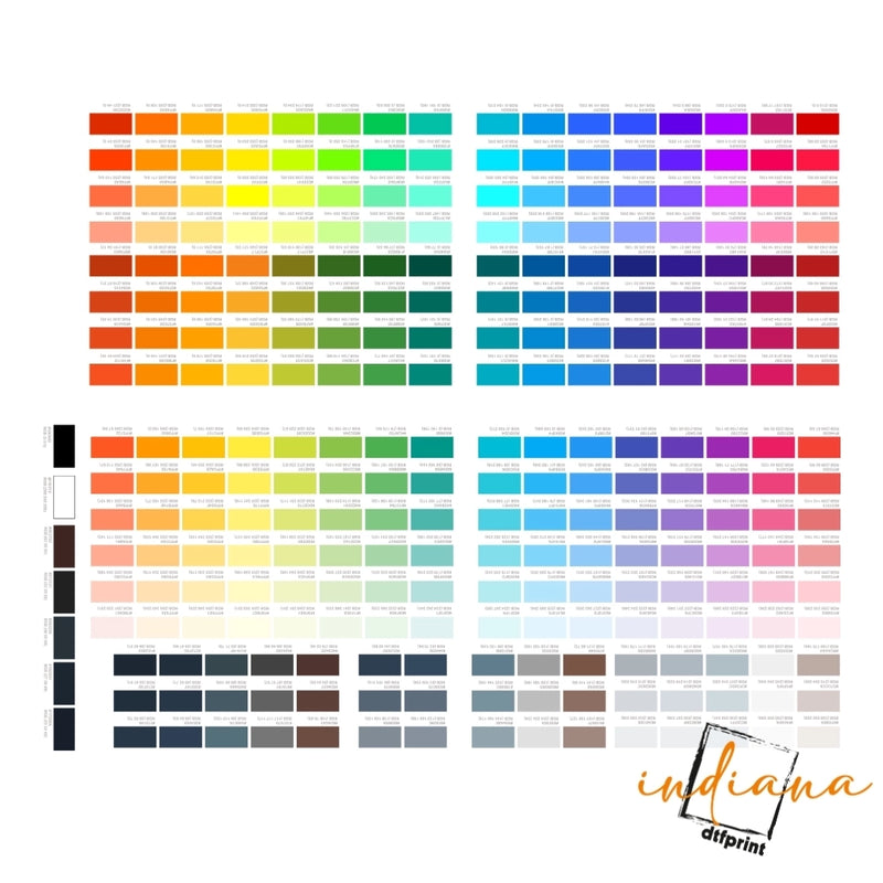
Choosing the Right Inks and Films
One of the most significant factors in making DTF prints more vibrant is ink quality. High quality pigment inks provide more saturated, durable colors. Lower quality inks may fade quickly or appear muted. Similarly, the PET film used for your transfers influences vibrancy. Films with proper adhesion and smooth surfaces ensure optimal ink coverage.
Always test your best inks for vibrant DTF prints to find those that work well with your fabric type and printer. This small step can dramatically improve DTF print vibrancy without additional adjustments.
Optimizing Your Design Files
Even before printing, your design files impact color intensity. Use high resolution images and design software that allows precise color management. Adjusting contrast, saturation, and brightness digitally before printing can make your DTF transfer color optimization much more effective.
Applying DTF vibrant colors guide principles during design ensures that your final prints look closer to your envisioned colors, avoiding dull or washed out results. Proper digital preparation is half the battle in achieving vibrant DTF prints.
Heat Press Settings for Vibrant DTF Prints
The way you heat press your transfers directly impacts color output. Incorrect temperature, pressure, or pressing time can dull colors or create uneven prints. Follow these DTF transfer brightness settings for optimal vibrancy:
-
Temperature: 160–170°C (320–338°F)
-
Pressing Time: 15–20 seconds
-
Medium Pressure, adjusted to fabric thickness
Experimenting with these parameters and following best settings for vibrant DTF prints ensures strong adhesion and maximum color saturation. Remember, even slight adjustments can dramatically improve your DTF prints color punch.
Pre Press Techniques
Wrinkles vanish when heat hits the fabric early. A quick steam flattens everything, making room for crisp transfers. Lay a fresh cotton square on top of the artwork during pressing, it blocks fuzz while locking in color depth. Dull prints gain strength this way, quietly but fully.
Dark clothes often need a base coat so colors show up better. When printing on fabric, that first layer helps the shades pop more. Bright outcomes stick around if everything stays even across each shirt.
Post Press Care for Maximum Color
The vibrancy of your DTF transfers doesn’t end at pressing. Proper care extends life and maintains color intensity. Wash garments inside out in cold water, avoid high heat ironing on the print, and air dry when possible. These DTF print vibrancy tips help maintain long lasting, vivid prints.
Troubleshooting Common Issues
Even with proper inks and pressing, sometimes prints may appear dull. Common issues include:
- Under or over pressing (affects color brightness)
- Uneven pressure (creates patchy colors)
- Poor quality inks or films
- Incorrect digital file settings
Addressing these issues following your DTF vibrant colors guide ensures that your prints are consistent, colorful, and professional.
Advanced Techniques to Boost Vibrancy
For seasoned users, additional steps can further enhance your DTF transfers:
- Layering colors in the digital file for stronger saturation
- Using specialty inks for neon or metallic effects
- Adjusting powder adhesion for even ink application
- Experimenting with double pressing for extra vibrancy
These advanced techniques let you improve DTF print color to industry leading standards, making your prints stand out in any market.
Conclusion
Start strong with the right ink. Pick designs that shine when printed flat. Settings on the heat press matter more than most think. Wait until the transfer cools before peeling. Wash gently to keep colors bold. Each choice changes how bright it looks later. Small moves add up over time.
From custom shirts to hoodies or promo gear, getting these methods right keeps your DTF prints sharp. Bright results come through careful steps, not luck. Each detail matters most when durability meets design. Done well, the outcome speaks without noise. For premium supplies, expert advice, and high quality DTF printing solutions, visit Indiana DTF Print.
FAQs
1. How can I make DTF prints more vibrant?
Use high quality inks, optimize digital files, pre press garments, and follow correct heat press temperature, pressure, and time to maximize DTF transfer color optimization.
2. What affects DTF print vibrancy the most?
Factors include ink quality, PET film smoothness, garment preparation, heat press settings, and post press care. Proper adjustments ensure maximum color intensity.
3. Can digital file adjustments improve DTF colors?
Yes, increasing contrast, brightness, and saturation in your design software can enhance DTF prints color punch, making your final transfers brighter and more eye catching.
4. What heat press settings give the best DTF colors?
Optimal DTF transfer brightness settings are 160–170°C for 15–20 seconds under medium pressure, adjusted for fabric type to maximize ink adhesion and vibrancy.
5. Does pre pressing garments improve print vibrancy?
Absolutely. Pre pressing removes moisture and wrinkles, creating a smooth surface, which helps increase vibrancy for DTF shirts and ensures even color distribution.
6. Can low quality inks reduce DTF print brightness?
Yes, inferior inks can appear muted and fade faster. Using best inks for vibrant DTF prints is crucial for high saturation and long lasting results.
7. How do I fix uneven colors on DTF prints?
Check your heat press pressure, temperature, and time. Uneven application or poor film quality can cause dull or patchy results.
8. Should I adjust my powder adhesion for brighter colors?
Yes, correct powder adhesion ensures full ink coverage, improving color vibrancy and maintaining DTF prints color punch.
9. Can I enhance DTF prints for dark fabrics?
Yes, using an underbase layer boosts opacity and brightness, ensuring your DTF transfer color optimization works effectively on dark shirts.
10. How do I maintain vibrancy after washing?
Follow proper care: wash inside out, cold water, air dry, and avoid direct ironing on prints to retain DTF print vibrancy over time.


